This brand manual establishes distinct guidelines for how all aspects of XSponse’s company brand will be handled. It gives guidance for creating a unified and identifiable presence.
About the XSponse
At XSponse, our mission is to transform security and automation through an Al-driven ecosystem that delivers actionable insights, enabling immediate action and reaction.
We provide innovative, integrated security solutions that enhance detection, alerting, and mass notification systems. Designed and built by integrators, our fully POE solutions are easy to install, seamlessly integrated, and deliver real-time intelligence. We offer end-to-end solutions for an evolving security landscape. With features like automated lockdowns, wearable badges for instant location tracking, and 911 support, XSponse empowers organizations to respond swiftly and effectively, ensuring safety, security, and peace of mind.
Design
Creative Process
X (Connectivity)
Security Elements
(X) Icon
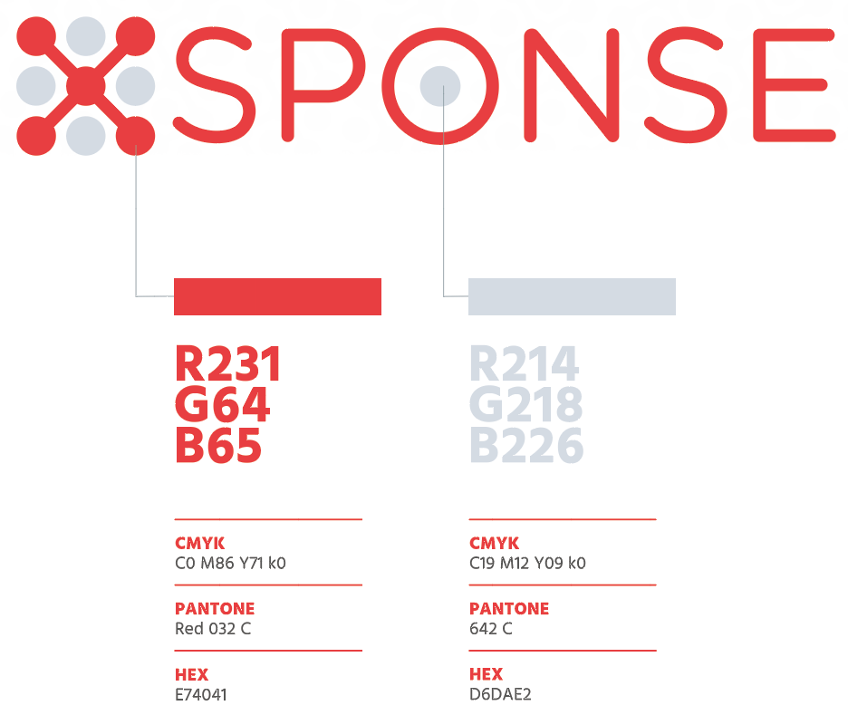
Primary Logo
The proportions and colors always need to be respected. The logo can be used in a positive and negative version, depending on the background. The positive version of our logo is in Coral Red and Gunsmoke Gray.
Negative Logo
The negative version of our logo is in white. We always use this version on a dark background.
Clear Space
The XSponse logo can be used in various size formats but should not be reduced smaller that 2″ in width; any smaller and it becomes illegible.
To ensure high visibility and an uncluttered presentation, always maintain “clears pace” around the logo. A minimum of 50 percent of the height of the logo should be retained for clear space; the purpose of this space is to isolate the logo from surrounding elements, giving appropriate prominence to the logo.
Typography
Hind is the primary font of XSponse. We use the Hind Bold font in small caps for big titles, top headers, copy lines and all first line communications. Exceptionally, we can also put short copy in Hind Bold or Hind Light as long as it remains legible.
AaBb
Primary Font
Hind Bold
abcdefghijklmnopqrstuvwxyz
1234567890
Typography Combinations
This is a
fictional
headline.
Lorem ipsum dolor sit amet, consectetur adipiscing elit, sed do eiusmod tempor incididunt ut labore et dolore magna aliqua. Ut enim ad minim veniam, quis nostrud exercitation ullamco laboris nisi ut aliquip ex ea commodo consequat. Duis aute irure dolor in reprehenderit in voluptate velit esse cillum dolore eu fugiat nulla pariatur. Excepteur sint occaecat cupidatat non proident, sunt in culpa qui officia deserunt mollit anim id est laborum.
Colors
Coral Red is our principal color. We use this red to highlight the presence of our brand and to help our users immediately identify us. In the majority of uses, we want a strong contrast between all of the colors used. Solid colors work best in printed applications and for text.
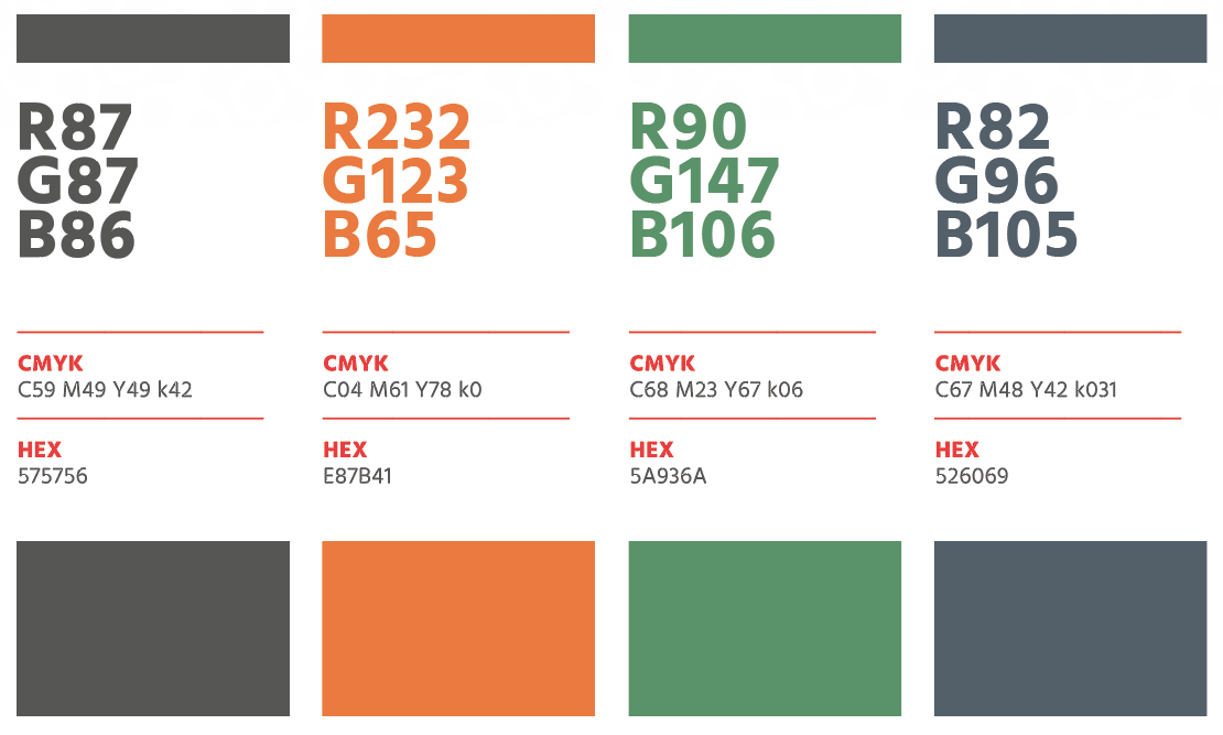
Secondary Colors
There are four colors in the XSponse color palette, not including white. The brand should be chiefly dichromatic, though there may be exceptions to this guidance. Tints of colors are permitted as long as the integrity of the color is maintained. This is done by increasing the white value to create lighter shades of each color. Gradients should be used subtly and mainly on backgrounds as a vignette treatment.
top
Inactive
Remote Support
XSponse now offers live remote support using Splashtop! Whether you’re a customer with access to our full support system or just need quick assistance, we’re here to help.
Follow these quick steps to get help: 1. Click the button below to download the Splashtop support tool. 2. Run the tool and provide us with the code it generates. 3. Sit back while our support team solves your issue remotely!